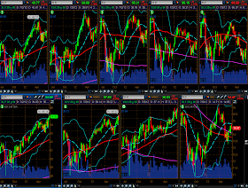
Below are a series of chartgrids of the 4 Major Indices and 9 Major Sectors showing Monthly, Weekly, and Daily timeframes. Each chart contains a set of Bollinger Bands, a 50 sma (red), and a 200 sma (pink). Generally, the mid-Bollinger Band (20 sma) will represent the "MEAN" to which price will revert as markets become overbought or oversold at their upper and lower Bollinger Bands. Price above the mid-Bollinger Band will be considered "BULLISH." Price below the mid-Bollinger Band will be considered "BEARISH." A green candle will depict "RISK ON" and a red one will depict "RISK OFF."
I'll provide commentary on the long, medium, and short-term trend/risk appetite relative to their Monthly, Weekly, and Daily charts, respectively.
Chartgrid #1 depicts a Monthly timeframe of the 4 Major Indices (Dow 30, S&P 500, Nasdaq 100, and Russell 2000)...my comments refer to the current month's (July's) candle.
- "BULLISH" so far this month for all 4 Indices.
- "RISK OFF" so far this month on the Dow, S&P, and Nasdaq. "RISK ON" on the Russell. Still room for these indices to rally to their upper Bollinger Band if they stay above the "MEAN."
- Long-term, the Russell is lagging in strength and is the one to watch, as a drop below its "MEAN" could send it down to the lower Bollinger Band and pull the others down with it. The S&P is in imminent danger of a bearish "Death Cross" moving average formation occuring on this timeframe...one to watch for market reaction.
Chartgrid #2 depicts a Weekly timeframe of the 4 Major Indices...my comments refer to this past week's candle.
- "BEARISH" for the Dow, S&P, and Nasdaq. "BULLISH" for the Russell.
- "RISK OFF" this past week on the Dow, S&P, and Nasdaq. "RISK ON" on the Russell. 3 are in danger of falling to their lower Bollinger Band if they stay below the "MEAN."
- Medium term, the Russell is leading in strength and is the one to watch, as a continued move upward could propel it up to the upper Bollinger Band and pull the others up along with it.
Chartgrid #3 depicts a Daily timeframe of the 4 Major Indices...my comments refer to Friday's candle.
- "BULLISH" for all 4 Indices.
- "RISK OFF" on Friday on all 4 indices...in danger of falling to the "MEAN."
- Short term, the Russell is leading in strength and is the one to watch, especially if it drops all the way back down to its "MEAN," as that could pull the others below their "MEAN" and, potentially, move these indices back down to their lower Bollinger Band.
The graph below shows money flow for the 9 Major Sectors during the current month, so far, as well as the past week...XLY (Consumer Discretionary), XLK (Technology), XLI (Industrials), XLB (Materials), XLE (Energy), XLP (Consumer Staples), XLV (Health Care), XLU (Utilities), and XLF (Financials).
Chartgrid #4 depicts a Monthly timeframe of the 9 Major Sectors...my comments refer to the current month's candle.
- "BULLISH" so far this month for XLY, XLK, XLP, XLV, AND XLU. "BEARISH" for XLI, XLB, XLE, and XLF.
- "RISK ON" so far this month for only XLP (Consumer Staples Sector). "RISK OFF" for the other 8 Sectors.
- Long term, XLF (Financials Sector) is the weakest of the 9 Sectors and is the one to watch for either increasing weakness or strength, and is at a crossroads with its steeply downtrending 50 sma. The Defensive Sectors (XLP, XLV, and XLU) are still under the heaviest accumulation from their 2009 lows.
Chartgrid #5 depicts a Weekly timeframe of the 9 Major Sectors...my comments refer to this past week's candle.
- "BULLISH" for XLP, XLV, and XLU. "BEARISH" for XLY, XLK, XLI, XLB, XLE, and XLF.
- "RISK ON" for only XLP. "RISK OFF" for the other 8 Sectors.
- Medium term, XLP (Consumer Staples Sector) is the one to watch to see if it continues to outperform next week...XLF (Financials) is also one to watch as it's the only one that is under the influence of a bearish "Death Cross" moving average formation. The Defensive Sectors (XLP, XLV, and XLU) are still under the heaviest accumulation from the beginning of this year.
Chartgrid #6 depicts a Daily timeframe of the 9 Major Sectors...my comments refer to Friday's candle.
- "BULLISH" for all 9 Sectors
- "RISK ON" for XLY, XLB, XLE, XLP, XLU, and XLF. "RISK OFF" for XLK, XLI, and XLV.
- Short term, XLB (Materials Sector) and XLE (Energy Sector) are ones to watch as they're struggling under the influence of a bearish "Death Cross" moving average formation on this timeframe...XLI (Industrials Sector) and XLF (Financials Sector) are worth watching to see if a "Death Cross" forms on these sectors. The Defensive Sectors (XLP, XLV, and XLU) are still under the heaviest accumulation on the Daily timeframe as they're the furthest above their 50 sma...ones to watch to see if price reverts back to the 50 sma, or even lower, potentially dragging the other Sectors further down, as well.
In summary, it appears that the way the markets are being played at the moment is "Aggressive on the Defense vs. Light on the Offense."
Enjoy your weekend and good luck next week!


