Pages

Tuesday, July 31, 2012

Consumers All Shopped Out Amidst Rising Prices


Data for Store Sales released today shows that consumers reigned in their spending for the week, "driving the year-on-year to only +1.8% for one of the lowest rates of the recovery."


This was is spite of a rise in Personal Income for the month, while the price of goods (and housing) rose. Perhaps buyers are waiting for "back-to-school" sales before they part with any extra cash...or even paying off debt.


So far today, the credit card stocks are down from yesterday's close, as Visa pulls back from yesterday's all-time high...ones to watch for any further weakness developing.

Monday, July 30, 2012

The Fate of the Major Indices in Q3 of 2012

Further to my post of June 29th, I thought I'd show where the Dow 30, S&P 500, Nasdaq 100, and Russell 2000 Indices are currently trading in their 2012 Q3 timeframe relative to the prior quarters. In that post, I mentioned that if the Q3 candle retested the Q1 lows again, I'd be very skeptical of much of a convincing advance above this year's high during these three months.

As can be seen on the updated Quarterly charts below, the current Q3 candle did, indeed pullback, but hasn't quite retreated to the Q2 lows, although the Nasdaq came close. Instead, an "inside" candle has formed, with price near the top on the Dow, S&P, and Nasdaq. The Russell is the laggard in roughly the middle.

As you can see, with the exception of the Nasdaq, these markets are trading in the vicinity of their price levels of the pre-2007/08 financial collapse and face major resistance up to their all-time highs. The candle action, so far for Q3 tells me that markets are attempting to garner bull support to advance further and retest those all-time highs. However, a failure to rally and hold above this year's highs will tell me that these markets are, indeed, weak at these levels, and will likely fall back, possibly to the middle of their large trading range (retreat to their "mean').

Due to the increasing weakness and unemployment problems that the global economies are facing, along with ever-surfacing financial improprieties (all of these problems have escalated since 2007/08), and the impending "Fiscal Cliff" in the U.S., it's my opinion that the latter is the more likely scenario without a concerted global intervention that addresses all economic, fiscal, and monetary problems as a complete package...and, by this, I mean real action and not just empty innuendos and temporary monetary tactics by world bank and political leaders...the sluggish and choppy action on the Q2 and Q3 candles confirms this lack of confidence by market participants at the 2007/08 levels.

Friday, July 27, 2012

Money Flow for July Week 4

Further to my last weekly market update, this week's update will look at the Major Indices and Major Sectors to assess strength vs. weakness in these groups during the past week.

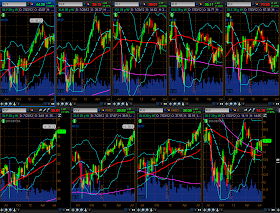
The Weekly chartgrid below of the YM, ES, NQ and TF shows that price has been locked in a tight upward-sloping trading range from their June lows, with market action see-sawing back and forth each week.

This is the first week since that time that all four E-mini Futures Indices have closed above the mid-Bollinger Band (for today's exercise, I'll refer to this point as their "mean" on the Weekly timeframe). All four closed near their weekly high.


The Weekly chartgrid below of the nine Major Sectors shows the same weekly roller-coaster action...XLY (Consumer Discretionary), XLK (Technology), XLI (Industrials), XLB (Materials), XLE (Energy), XLP (Consumer Staples), XLV (Health Care), XLU (Utilities), and XLF (Financials).
Seven of the nine Sectors closed above the mid-Bollinger Band ("mean") (four of them for the first time since their June lows -- XLY, XLK, XLI and XLE)...the two exceptions are XLB and XLF, which closed just below. All of them closed near their weekly high.


The 4-Hour chartgrid below of the YM, ES, NQ and TF shows a close-up of this trading range. You can see that price bounced off the lower end of the range, which happens to coincide with a 50/50% Fibonacci fanline bisecting confluence level (horizontal broken blue line) on the YM and ES, while the bottom of the range is below this level on the NQ and TF.


Further to my post of July 19th, the Daily chart shown below depicts action of the SPX:VIX ratio pair from the beginning of this year.  In that post, I had mentioned that if the SPX was to move higher, it would have to remain above a potential Inverse Head & Shoulders neckline at 82.50ish.

After this week's wild gapping move to the downside, followed by two successive gaps to the upside, price closed just above this level at 82.99. With any more moves below this neckline, the argument for a further and sustainable move to the upside becomes weakened and will cause me to re-think that this is not a valid IH&S formation, particularly since a lower swing low (and lower right shoulder) has now formed on this timeframe.


In summary, lest the markets fall prey to continued whippy, non-trending, roller-coaster action next week, and to convince us that a sustainable move upward has, in fact, begun in earnest (and not based on rumours and innuendos), it is important that the four E-mini Futures Indices, the nine Major Sectors, and the SPX:VIX ratio pair continue to move upward from Friday's close. Headwinds which may present problems for the U.S. markets are outlined in my posts of July 20th, July 19th, and July 17th and will need to be overcome in the process. We have interest rate decisions forthcoming from the FOMC on Wednesday, and the BOE and ECB on Thursday, as well as the U.S. Unemployment Rate release on Friday.

Buckle up...it's bound to be an interesting ride!


Enjoy your weekend and good luck next week!

Wednesday, July 25, 2012

Will the 2012 Olympics Solve Britain's Debt Woes?


The 2012 Olympic Games will open this Friday in London, England. This news article mentions a cost to the British taxpayer of more than nine billion pounds, with a hoped-for return of 13 billion pounds over four years (as suggested by Prime Minister David Cameron). This seems like a pretty big gamble "at a time when Britons are struggling with a double-dip recession, rising unemployment and severe public spending cuts."

Data released on Wednesday shows that Britain's GDP dropped further into negative territory at levels seen in mid-2009, as shown on the graph below.


The Daily chart below of London's FTSE Index shows market action as at Tuesday's close of 5499.23. Major support lies at 5500, at the moment, and market action from mid-2011 is, basically, in a large trading range, defined by a triangle...in fact, this range extends back to 2009-2010 and is forming a large diamond pattern...potentially a topping pattern with a 1300 point range.

A drop and hold below this diamond could very well send London's equity index tumbling, possibly by 1300 points from 5500 down to the 4200 level, or lower...one to watch, along with future GDP data releases, as well as Libor fallout, over the coming weeks.


Monday, July 23, 2012

Oil's Slippery Ride

Further to my post of July 17th, once again, Oil finds itself testing rising channel support on the Weekly chart below. At the moment, it's trading in between the 50 sma (red) and the 200 sma (pink) in an attempt to break out of this range either to the upside or the downside. Its recent rally didn't quite make it all the way up to the "mean" (mid-Bollinger Band).


However, price on the Commodities ETF (DBC) and the AUD/USD forex pair Weekly charts below did manage to rally up to push slightly beyond their "mean", but pulled back to it on DBC and just above on AUD/USD in Monday's action.


A failure to hold the channel support on Oil and the "mean" on DBC and AUD/USD could well send all of these back down to their lower Bollinger Band or lower. A move lower could negatively influence equities.

In this regard, 64.00 to 72.50 represents an important confluence zone for the SPX:VIX ratio pair....price closed just above 72.50 on Monday. A break and hold above 72.50 would send the SPX higher to, potentially, the last swing high, or higher, while a break and hold below 64.00 would send it lower to, potentially, the June lows, or lower...worth watching to gauge either a strengthening or further weakening in equities.

Friday, July 20, 2012

Money Flow for July Week 3

The markets have lost much of their glossy sparkle during the past one-year period, both globally and in the U.S, and are in need of a major "touchup."


Further to my last weekly market update, this week's update will take a look at global and domestic markets to assess strength vs. weakness in each group during the past one-year period, as well as the past week.

Below are a series of one-year Daily charts, graphs depicting money flow for a one-year period, as well as graphs depicting money flow for the past week, together with general commentary on each grouping.

Group 1 features the U.S. Major Indices. You can see from the chart and the first graph that the Utilities Index is leading in strength for the one-year period, while the Nasdaq 100 Index took over the lead during this past week. The laggards for the year, and for the past week, are the Russell 2000 and Dow Transports Indices.


Group 2 features the 9 U.S. Major Sectors. The overall Sector leaders for the one-year period are Utilities, Consumer Staples, and Health Care (the defensive sectors), while Energy, Materials, and Technology gained the most during the past week. The laggards for the year are Financials, Energy, Materials, and Industrials...and for the week are Financials and Consumer Staples.


Group 3 features Germany and France, as well as the PIIGS countries (Portugal, Italy, Ireland, Greece, and Spain).  The only country to have gained during the one-year period is Ireland, while there were some minor gains in Greece, Germany, Ireland, and France during the past week. The biggest loser during the past year is Greece, followed by Spain, Italy, Portugal, France, and Germany...and during the  past week is Spain, followed by Italy, and Portugal.


Group 4 features the Emerging Markets Sector (EEM) and the BRIC countries (Brazil, Russia, India, and China). None of the countries nor EEM have made any gains during the one-year period, while Russia and EEM made some gains during the past week. The biggest loser for the year is Russia, followed by China, EEM, Brazil, and India...and for the past week is China, followed by India, and Brazil.


Group 5 features the Canadian ($TSX), Japanese ($NIKK), and World Indices. All of these three are lower than they were one year ago, while gains were made in the World Index and Canada during the past week. The biggest loser during the past year is the World Index, followed by Japan, and Canada...and for the past week is Japan.


Group 6 features the Commodities ETF (DBC), Agricultural ETF (DBA), Gold, Oil (see my posts of July 17th and July 11th for recent references to Oil), Copper, and Silver. All of these are lower than they were one year ago, while gains were made in Oil, DBC, and DBA during the past week. The biggest loser during the past year is Silver, followed by Copper, Commodities, Agriculture, Oil, and Gold...and for the past week is Copper, followed by Gold.


Group 7 features the 7 Major Currencies (U.S. $, Euro, Canadian $, Aussie $, British Pound, Japanese Yen, and Swiss Franc). The U.S. $ has performed the strongest over the one-year period, while gains were made in the Aussie $, Japanese Yen, British Pound, Canadian $, and U.S. $ during the past week. The biggest loser during the past year is the Swiss Franc, followed by the Euro, Canadian $, Aussie $, and British Pound...and for the past week is the Swiss Franc and Euro.


In summary, the markets have been playing defensively over the past one-year period, with the majority of the money flowing into the U.S. $, Utilities, Consumer Staples, Health Care, Nasdaq 100 Index, S&P 500 Index, and Dow 30 Index. Hardest hit during the past year have been Europe, the PIIGS, the BRIC countries and EEM, Silver, Copper, the Swiss Franc, the Euro, Japan, Canada, the Russell 2000 Index, and Dow Transports Index. As such, there has been more weakness, world-wide, than strength during the past year. The one-year leaders are the ones to watch to see if this relative strength continues, or if they begin to weaken.

During the past week, some money has begun to flow into the Aussie $, Japanese Yen, British Pound, and Canadian Dollar, the more risky Sectors such as Energy, Materials, Technology, Industrials, and Consumer Discretionary, Greece, Germany, France, Russia, EEM, the World Index, Canada, Oil, Commodities, and Agriculture...ones to watch to see if this inflow of money continues next week and beyond (perhaps into the next FOMC meeting on July31/August 1st). Headwinds which may present problems for the U.S. markets are outlined in my posts of July 20th, July 19th, and July 17th and will need to be overcome in the process.

Enjoy your weekend and good luck next week!

Weak Financials/Banks

Without a concerted strengthening in the Financials/Banks, it will be difficult for the Major Indices to continue to garner a meaningful rally, particularly in view of the comments I made in my post of July 19th.

The Daily charts below show market action, so far, as I write this mid-day on Friday...not an impressive or supportive showing in the Financials Sector and Banks.

Intraday volatility is building slightly in the VIX, as well, as the SPX:VIX ratio pair trades under 82.50 at the moment.

Thursday, July 19, 2012

SPX:VIX Ratio Pair Headwinds

I've drawn a Fibonacci retracement on the Daily chart below of the SPX:VIX ratio pair and have identified a potential Inverse Head & Shoulders pattern.

The first external Fib level of 127.2% at a price level of 92.30ish happens to lie at a confluence/apex of trendline resistance...just above current price.

If the SPX is to move higher, it will have to capture this level and remain above...in this regard, it will be important that the neckline hold at 82.50ish.


However, as can be seen from the Quarterly chart below, that won't be an easy task, as efforts to move much higher since 2004 have been met with profit-taking and choppiness.

Unless some kind of major liquidity injection is forthcoming into the markets soon (e.g. cash on the sidelines), I expect more of the same (profit-taking and choppiness) at current levels on the SPX. However, that will depend on market participant confidence, which seems to have eroded.

Mid-Day Report on YM, ES, NQ & TF

The Weekly charts below of the YM, ES, NQ & TF show that price has popped above the mid-Bollinger Band as I write this just after noon on Thursday.

At the moment, I'd place general near-term support at this level, which is 12777 for YM, 1354.50 for ES, 2625.50 for NQ, and 792 for TF.

If these levels hold, potential targets are their upper Bollinger Band, or higher...otherwise, I'd look for price to fall, once again, to their lower Bollinger Band/50 sma (red), or lower.


Tuesday, July 17, 2012

Back to the "Mean"

Where is Oil headed? A clue may lie in the AUD/USD forex pair Weekly chart.

As you can see from the three Weekly charts below of the Commodities ETF (DBC), AUD/USD, and Oil, the Aussie $ closed above 1.03 on Tuesday, and price now sits just above a confluence of its mid-Bollinger Band ("mean"), the 50 sma (red), and a price apex level of 1.0274 (which also happens to sit near the left shoulder of a potential large and unwieldy Head & Shoulders formation). It's important that this confluence level hold as support in order that the Aussie $ may continue upward to, potentially, its upper Bollinger Band or higher.

Price on Oil sits just below a Fibonacci confluence level of 90.18 and just above the bottom of a large uptrending channel. Should the Aussie $ continue to rally, we may see Oil reach its "mean" at 94.89 (which is also a confluence of the 50% Fibonacci retracement level, the mid-Bollinger Band, and the 50 sma) or continue higher to, potentially, its upper Bollinger Band.

Furthermore, it wouldn't hurt to see DBC hold above its mid-Bollinger "mean" and continue its trek up to its confluence level of 27.47 or higher in support of these moves.

A failure to move higher on one of these three could well negatively influence the others...worth watching all of them to see if any weakness develops.


Follow-Through Needed

Further to my posts of July 16th and July 17th, here's how the current 3 days/candle closed today on the Major Indices.

On the 4 equity indices, we need to see further strength enter on the Nasdaq 100 and the Russell 2000 in order to support any further rally on the Dow 30 and S&P 500.

On the 3 Dow indices, we need to see further strength enter on the Dow Transports in order to support any further rally on the Dow 30 and Dow Utilities.

Unless we see further upside continuation on all Major Indices, we'll likely see an ultimate failure of the recent upward sloping channel which begins at the June lows, with a potential move lower than those lows, as these markets are looking tired, laboured, and choppy.


Furthermore, the SPX will need to overcome and hold above 84.00 on this 60 min SPX/VIX raio pair if it is to resume a rally. It's been rejected at this level on the last several attempts, including today's, so far, this month.


Market Action During Bernanke Testimony Tuesday Morning

I have a couple of remarks to make about the morning's action, so far, during Mr. Bernanke's testimony before the Senate Banking Committee.

Further to my post of July 16th, a near-term support level of 483.00 has been re-tested and is holding, so far, on the Utilities Index, as shown on the 15 min chart below...one level that I'm watching relative to weakness/strength on the other Major Indices. Near-term resistance of 485.60-486.00 lies overhead and would need to be overcome in order to push the other markets higher.


The low and high of the recent small "diamond" pattern on the SPX:VIX ratio pair have been re-tested this morning as shown on the 60 min chart below...price now sits at the next resistance level of 83.93...the next hurdle for the SPX to overcome if it is to resume a rally.