Further to my last weekly market update, here is a summary of where money flow ended for Week 1 of April, 2012 (which was a short week because of the holiday on Good Friday).
The Weekly charts below of YM, ES, NQ & TF show that they all closed lower than the prior week on a bearish engulfing candle (which is a warning that further downside movement may be forthcoming on this weekly timeframe). Both the YM & TF have now closed below the uptrending channel, the ES closed just inside, and the NQ closed above the channel. Because these e-mini futures markets were open until 9:15am Friday morning, and because they all dropped considerably at 8:30am after the jobs and unemployment reports were released, this Weekly candle's close contains this drop...this drop won't, however, be reflected in these e-mini's Major Indices counterparts since these markets were closed.
Although each is sitting at one form of near-term support, we can see that volatility is building and money is flowing out of each...also, the TF failed to break above its February high...all signs of weakness. Once the markets have a chance to digest Friday's jobs and unemployment reports, we'll see whether this weakness blossoms into a further sell-off. We may see some stability return (or choppy, and possible volatile, action) until the Beige Book report is released on Wednesday. In the meantime, the next levels of support on the Weekly timeframe are at the middle Bollinger Band (12546 for YM, 1313.50 for ES, 2482.25 for NQ, and 781.10 for TF).
Below is a 4-Hour chartgrid of YM, ES, NQ & TF. They have all closed below their uptrending channel on this timeframe at or near a Fibonacci retracement level. We may see a retest of the underside of this channel before either a reversal of this uptrending channel begins, or the uptrend resumes. You can see how choppy the action has been during the current OPEX period (the broken vertical red line depicts the beginning of each one-month OPEX period) and how volatile the swings have become...all signs of building volatility, profit-taking, and a rejection of higher prices...we're now left with either triple top or head and shoulders formations...all bearish formations on this timeframe. Unless the highs of these formations are taken out (on increasing volumes) and held as support, it's my opinion that we can expect more weakness to come.
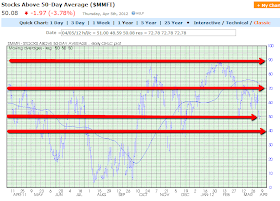
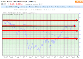
The three Daily charts below depict support and resistance levels on the percentage of Stocks Above 20-Day, 50-Day, and 200-Day Averages.
Stocks Above 20-Day Average plunged and closed just above the 30% near-term support level...one to watch to see if this support level holds.
Stocks Above 50-Day Averaged also plunged and closed just above the near-term support level of 50%...one to watch to see if this support level holds.
Stocks Above 200-Day Average closed lower than last week and below the major support level of 70%...one to watch for possible further weakness below what is now resistance, once again.
The closing levels on all these three charts are lower than the prior week. I'd conclude that, in the short term, stocks are mildly bearish, in the medium term, stocks are neutral and subject to both bullish and bearish influences, and in the longer term, stocks are mildly bullish...but, as has been the case for the past two weeks, all are still on negative watch for further potential weakness.
Once again, the VIX gained on the week (by 6.78%), as shown on the graph below.
Further to the comments in my last weekly market update, the Daily ratio chart below of the SPX:VIX shows that the SPX failed to resume its trend upwards and broke down below its consolidation range. Negative divergences are still in place on the RSI, MACD, and Stochastics...however, they are approaching oversold levels, so the SPX may level out for awhile, or bounce around before either reversing or resuming its uptrend on this Daily timeframe.
The theme of increasing volatility and uncertainty on trend direction on the above-mentioned Weekly and 4-Hour timeframes, is, therefore, confirmed by this Daily ratio chart...all timeframes (and charts) are worth watching, along with the VIX.
As shown on the graph below of the Industry Groups, the only group to close (slightly) higher was Retail, with Gold/Silver as the biggest loser, with considerable losses on most of the others.
As shown on the graph below of the Major Sectors, there was considerable profit-taking on all sectors.
As shown on the graph below, losses were made in the Commodities ETF (DBC), Agricultural ETF (DBA), Emerging Markets ETF (EEM), U.S. Financials ETF (XLF), and the European Financials ETF (EUFN). The Chinese Financials ETF (GXC) was basically neutral on the week. Once again, the European Financials ETF was the biggest loser...one to watch in view of the information contained in my post of April 4th pertaining to the ECB Press Conference held on that day.
Further to the comments in my last weekly market update, China's Shanghai Stock Exchange Index continued its decline, then reversed on Friday to close just above its major support level of 2300, as shown on the Daily chart below. Whether this index can hold above this important support level, and whether the downtrending RSI, MADC, and Stochastics indicators reverse their recent downtrend remains to be seen...an important index to watch, along with the Emerging Markets ETF.
As shown on the graph below, losses were made in Gold, Oil, Copper, and Silver...with Silver incurring slightly heavier losses.
The following four Weekly charts of Gold, Oil, Copper, and Silver show support and resistance levels...ones to watch.
As shown on the graph below of the Major Indices, the Russell 2000 was the biggest loser, followed by the Dow 30, S&P 500, Nasdaq 100, Dow Utilities, and Dow Transports. Also, losses were made in the Emerging Markets ETF (EEM), the High Dividend-Paying Stocks ETF (DVY), and the Corporate Bonds ETF (JNK).
As shown on the currency graph below, money flowed into the U.S. $ and out of the Euro, Canadian $, Aussie $, and British Pound. Should we see volatility continue to increase over the coming week(s), I'd expect to see this trend continue...particularly if the U.S. does, in fact, enter a recession by the middle of this year, as outlined in my post of March 27th.
The Daily ratio chart below of the SPX:U.S.$ shows that there may be more room for downside movement on the SPX and upside movement on the U.S. $ until this ratio reaches a support level of approximately 17.00...one to watch.
With volatility building, I'd just remind you that "Mr. Fat Finger" may revisit the markets, as mentioned in my post of March 28th...it pays to have one's stops/hedges in place to try and mitigate any losses from such action.
Enjoy your Easter weekend!


